Shazza - Director
Cuddles
Cuddles
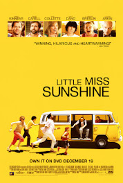
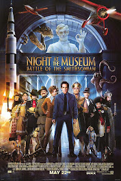
 I used the deep red colors form the movie poster, covered a heart shape in red, maroon and yellow buttons to depict the color of flames, single photo, paper tearing and I tied a piece of ric rac to my zig zag.
Amanda - Assistant Director
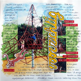
Walk with Me

Marisa - Production Manager
Me @ {48}

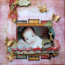
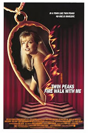
My layout for the first challenge, I got my inspirations from the colours on the movie poster and the portrait

Lisa - Producer
SHhh...

Lisa used the movie poster like a layout sketch. she tore the yellow paper, used one photo, and added ric-rac as her zig zags.
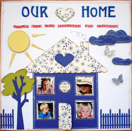
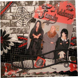
Family

I went with the colour scheme and the heart theme.
Zigzag frame and of course paper tearing as required.
 Corinne - Chief Editor
Sweet Lemonade

I used the poster as a sketch mimicking the flames around the heart using
flourishes and making the photo a half heart shape.
flourishes and making the photo a half heart shape.




+-+sometimes+angels+come+without+wings.jpg)
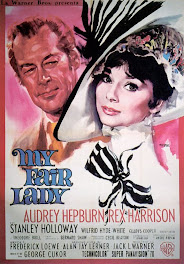
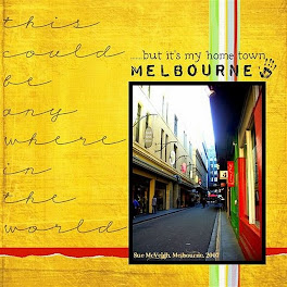


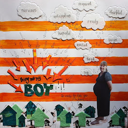
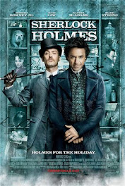
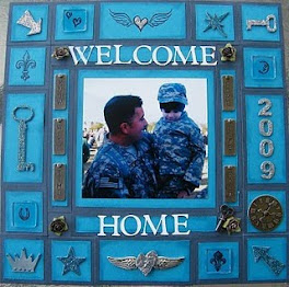


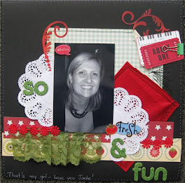
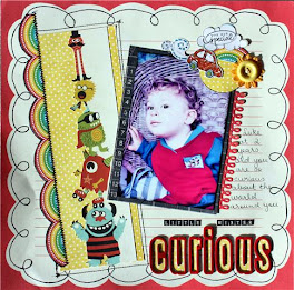

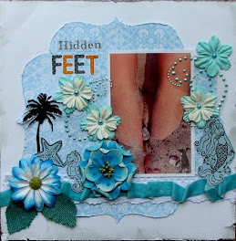




















I cant believe that everyone has such different takes on the movie poster, fantastic work!!!! very inspiring.
ReplyDeleteI agree... our layouts are all so different, but so beautiful! So many yummy things to look at! What a great way to start of the site!! :)
ReplyDelete