If you would like to sponsor a prize for a month please email Shazzaalleyes@hotmail.com We would love to advertise your site and add a paragraph about YOU on here!
Amanda Taylor with her entry 'United States of Money - It Doesn't Grow on Trees'
Golden Globe winner for January is....
Jolanda with her entry 'OPA'
Decembers winner is......
Angie Jones with her entry 'Jingle Bells'
Novembers Winner is .....
Polly Libby with her entry 'Love and Joy'
October's winner is
Jolanda Bravery with her entry 'We Love Molly Coggles''
Septembers winner is....
Jolanda Bravery with her entry 'Villa Volta'
The winner of our 3rd Birthday celebrations is....
Narelle Riley with her entry 'PARIS PARTY'
The winner of July's Movie Poster ....
is Megan with her entry 'Queen Bee'
The winner of June's Movie Poster is....
Kelly-Ann with her entry 'Awesome' Family Photos
The winner of Mays 'Memento poster is....
Helene with her entry 'Take a picture of me, Mummy!
The Winner of the 'EVER AFTER' movie poster for April is....
Holly Connors with her entry...'And They Lived Happily Ever After'
The winner of the 'Day After Tomorrow' movie poster is....
Narelle Riley
The winner of the 'Valentines Day' movie poster challenge is ....
Liz Simon with her entry '40 Years of Marriage'
Winner of the 'Miracle on 34th Street' movie poster is.....
Julene Matthews with her entry 'Miracle on 107th Street'
Winner of the 'White Christmas' movie Poster is.....
Liz hocking with her entry 'Christmas Feeling'
The winner of the Movie Poster 'Home for the Holidays' is.....
Jen Fawkes with her entry 'I Still Call Australia Home'
Winner of the 'Psycho' Movie Poster inspiration for October is......
Roxy Rolla with her double page layout 'Scary Halloween to you'
Winner of the RIO poster inspiration for September is....
Georgia Heald with her entry CRAZY!
Winner of the 'Holiday Inn' Movie Poster is.....
Mazlina with her entry 'I wanna be a Starship Trooper'
Winner of the 'All about Eve' movie poster for July is......
Amanda Toyer with her entry 'Short Arms'
Winner of the 'UP' movie poster inspiration for June is.....
Mazlina with her entry 'UP in the Air'
Winner of the 'Love Actually' challenge for May is.......
Talia Lynette
Winner of the 'Singin in the Rain' Movie Poster
is Emily Pearce with her entry 'Singing and Dancing in the Rain'
Winner of the 'Vertigo' Movie Poster for March is.....
Mazlina Yusoff - with her entry 'On Top of the World....
Winner of the 'Valentines Day' Movie Poster is...
Anita Maree with her entry 'My Valentine'
Winner of the January '9 to 5' Poster challenge
Jen Fawkes with her entry [not] a 9 to 5 job.
Winner of the 'Nightmare before Christmas' poster inspiration is......
Peggy Schenkels - Don't mess around with me
ACTION TAKE 12!! Decembers inspiration will come from the movie poster....
'The Nightmare before Christmas' by Tim Burton
ACTION take 11!! Novembers inspiration will com from the movie Poster....
'Casablanca'
Winner of Novembers 'Casablanca' challenge is.....
Jen Fawkes - 'Here's Looking at you Kid'
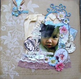
Winner of Octobers 'My Fair Lady' challenge
Melissa Pablo with her entry 'sometimes Angels come without Wings
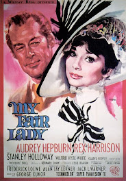
ACTION!! Take 10!!! Octobers inspiration will come from the Movie Poster ......
'My Fair Lady'
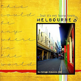
Winner of Septembers 'Invasion of the Body Snatchers' poster and added criteria is.....
Sue McVeigh with her entry .... 'My Home Town'
ACtion!! Take Nine!! September's inspiration will come from the movie poster......
Invasion of the Body Snatchers
Action Take Eight!! August's inspiration will come from the movie poster.....
'Juno'
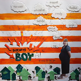
August 'Juno' winner is.......
Megan Vinn with her entry 'Bring me my BOY!'
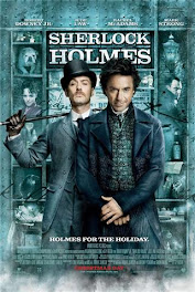
Action Take Seven...July's movie Poster is
Sherlock Holmes
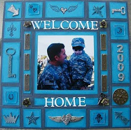
July winner is
Celina Matthews with her entry 'Welcome home'
Design Team winner is
Marisa Page with her submission 'Miss you Both'
Action Take Six, June's movie poster
Alice in Wonderland
June winner!
Melissa Zordilla with her entry 'Your own Wonderland'
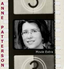
June Design Team member winner!
Anne Patterson with her submission 'Fairy Fun'
Action take Five, Mays movie poster...
Fried Green Tomatoes
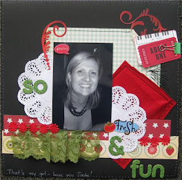
May winner
Deb Clark 'So Fresh n Fun'
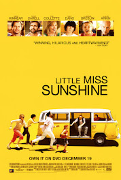
ACTION take Four!! Aprils Movie poster inspiration will come from.....
'Little Miss Sunshine'
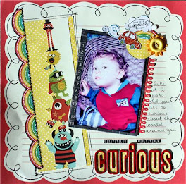
April Winner
Cathy Cafun - Little Mister Curious
ACTION Take Three!!! March's movie poster inspiration will come from.....
Happy Feet
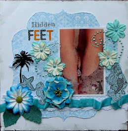
March Winner !!
Lindy Gillepsie 'Hidden Feet'
ACTION Take Two!!! February's Movie poster inspiration is....
Pirates of the Caribbean - At Worlds End
February's Winner!
Melissa O'Neill - 'Crawling the Plank'
Action Take One, January 2010 movie poster!
'Alfie'
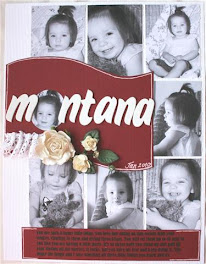
January's Winner
Bec Miller - Montana
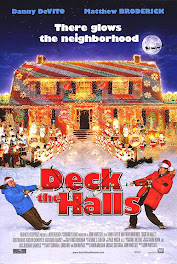
Action Take Five, Decembers movie poster.....
Deck the Halls
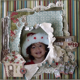
Decembers Winner.....
Maria Delo - Joy to the World
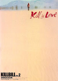
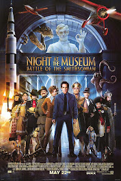
Action Take Four!! Novembers Movie Poster
Kill Bill 2 plus criteria = 1. negative space 2. must have a cutout from a photo/photos 3. must use blue, pink and yellow somewhere on your layout 4. painted title *Movie Diva Demand* For an extra bonus two points ....... paint your title red!! ( This is optional, you dont have to do this but it does give you the extra bonus points!)
November Winner!!
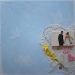
Lesley Forde - Book of Love
Action! Take Three! - Octobers Movie Poster
October Winner!!
Peggy Schenkels - Careful
Action! Take Two - September Movie Poster
Plus Criteria = use either red or blue cardstock, one piece of pp (patterned paper) and two word title
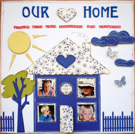
September Winner!!
Tina Holmstrom - Our Home
Action! Take One - August Movie Poster
PLUS criteria = single photo, paper tearing and zig zags somewhere on the layout!


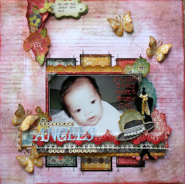+-+sometimes+angels+come+without+wings.jpg)


Very effective and dynamic Alanna.
ReplyDeleteJust Gorgeous! I love the contrast between the B&W & colour photo's...the contrasting red just pops right off the page! :)
ReplyDeleteLove the simplicity of this layout - the use of B&W is very effective.
ReplyDeleteLove this page...very stylish. Great photo on top of the B & W tiles.
ReplyDelete