Lisa Lofthouse - Dahl Face

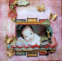
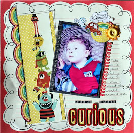
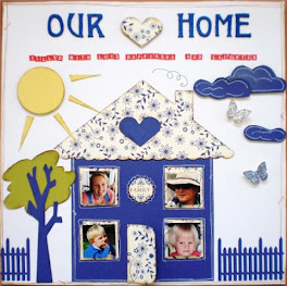
This is what Lisa had to say: I was inspired by the colours and the shapes in this poster doing a "window" style setup for the PP's. I wanted it to look like people were watching over my Aiden. I have placed it all on red cs.
Great layout Lisa, you've done an excellent job, a gorgeous photo of Aiden looking up. Is that a stamp shape flourish you have used, because it looks awesome , (I would love one of those :) Cheers Shazza





+-+sometimes+angels+come+without+wings.jpg)



































omg lisa this is an awesome take on the challenge, i love the placement of the pic and pps, and a cute pic of aiden, great work of the challenge
ReplyDeleteNice page Lisa! I like the scroll too!
ReplyDeleteLove the angel people watching over Aiden.
ReplyDeleteGreat layout Lisa
Great use of the windows! You have used all of the colours well in this layout. I like it!
ReplyDeleteWow! I love this and I too NEED to know more about that beautiful flourish!
ReplyDeleteThe flourish looks amazing! I love the photo of your little man too... gorgeous! xxx
ReplyDelete