Another Entry, this time from.........
Amanda, our sponsor and caleb for the month.Here is her take on the challenge:
***********
Amanda Lawrence - The Best Things

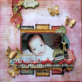
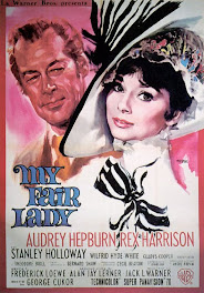
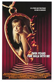
My layout is called “The Best Thing” and I have created it using papers from Graphic 45. I have taken inspiration from the colour scheme in the poster mainly but also from a few other things. I pleated some dark burgundy paper to give the look and feel of a velvet curtain and also used a paper doily to represent the half heart. I used paper tearing and rolling at the bottom of the photo and my zig zags are the black ric rac I have used in the corner. To finish it all off I have used lots of rich burgundy and gold embellishments to give the whole layout that velvety decadent feeling.
OMG Amanda it's divine, love all your embellishments, great pic, you have really gone to a lot of trouble and used quite a number of techniques... I am impressed!!!




+-+sometimes+angels+come+without+wings.jpg)






















Wow Amanda what a stunning page! Absolutely Gorgeous!
ReplyDeleteWelcome to the Film set!
Ali
(production Assistant)
stunning amanda, love all of this
ReplyDeleteAmanda... this layout is stunning!! I love the rich colours, just like those movie theatres of days gone by!
ReplyDelete