Marisa Page - Little Miss Grumpy

Hi Shazza,
Well I loved working with this poster for the April challenge.
I have used colours yellow, off white & black.
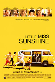
All the criteria was covered: use yellow colour, 'Little Miss' in title and a car which is in the photo.
This is the first layout that I have used hessian and I like how it looks.
I also used a strip of gingham material with these cute little bees which just suited the layout so well.
I am looking froward to seeing what everyone else creates from this poster.
Regards,
Marisa Page
Marisa Page
Glad you enjoyed the inspiration, you have done a great job. The hessian looks great and the gingham material has worked in well. Love your sub for this month, you must be pleased with how it turned out! - Shazza




+-+sometimes+angels+come+without+wings.jpg)
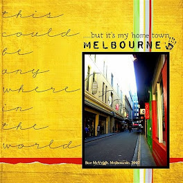





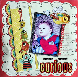

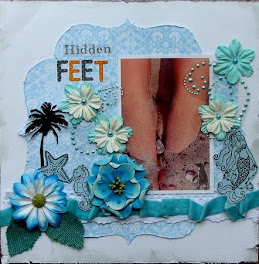


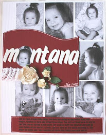




















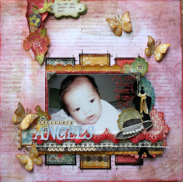
Love your use of the different fabrics on this. Just adds a lot of texture - which I love. Beautiful layout.
ReplyDeleteWhat a beautiful LO. So pretty and the heshian does look great.
ReplyDeletethis is stunning, love it all
ReplyDeleteThe title so made me giggle, reminds me of my daughter, well done, love the flowers and bow, love the layout!
ReplyDeletelove the texture from the fabric and the title - love that font!
ReplyDelete