
Lisa Hanrahan - What Do You See?
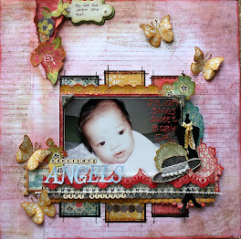
 Here is what Lisa had to say... I always enjoy creating a layout with negative space. This photo is one of my favourites! It is of my daughter at a local park. I cut away the top of the photo to emphasize the top of the fence and gate. I have handcut flowers around the base of the photo to look like she is standing in a garden. I have included pink, yellow and blue patterned paper and used red paint when I stamped some of my title.
Love this Lisa! Great photo, love your flowers (cute owl), machine stitching, and you get the bonus points for painting your title red!! Well done - Shazza


+-+sometimes+angels+come+without+wings.jpg)


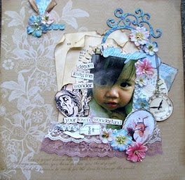


this is gorgeous lisa, love how you cut away the top of the photo..............love it all
ReplyDeleteI agree with Amanda, love how you have cut away the top of the photo. And I love the rhinestones added to the flowers ... fab layout
ReplyDeleteCute photo, Love the cut out of the fence! All the flowers give it a lovely bright garden feel. Great job Lisa!
ReplyDeleteI love how you cut the fence out and so it then becomes part of the whole LO like that, amazing as is the whole LO - it really draws you into it.
ReplyDeleteLisa I love this! Those flower clusters are just gorgeous and I love the photo with the cut out top...
ReplyDelete