Sue McVeigh - My Home Town

Hey Shazza,
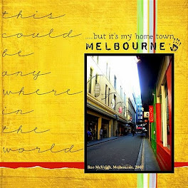
Here is my September challenge layout!!
Yellow & red cardstock - check.
Black title - check.
Hand print - check.
Again I have used one of my favourite photos, and I'm
really happy with how the page turned out!
Thanks again for providing a great challenge.
Cheers, Sue
Wow!! Love this photo Sue. I love the angle you photographed this on.
Your photography is awesome :) It's really come up a treat!
All criteria covered as well, well done and thanks for playing along :)
Cheers Shazza
Wow!! Love this photo Sue. I love the angle you photographed this on.
Your photography is awesome :) It's really come up a treat!
All criteria covered as well, well done and thanks for playing along :)
Cheers Shazza


+-+sometimes+angels+come+without+wings.jpg)































stunning photo, love this
ReplyDeleteStunning! Which lane is that?
ReplyDeleteA great perspective photo and your title looks fantastic too!Love the whole thing!
ReplyDeleteFantastic Layout Sue...I love how it all works together
ReplyDeleteWow - love this layout! You've done a fantastic job here - AWESOME!!
ReplyDeletethanks for your comments!! it is Degraves St
ReplyDeletefabulous, love this and so different, so great to see :D
ReplyDeleteWhat a great layout Sue :) love the photo and the journaling down the side of the page.
ReplyDeleteWhat a wondeful LO and the simplicity of it is so eye catching.
ReplyDeleteStunning!! Love how the yellow pops right out! Great photo too.
ReplyDeleteI just love this LO. Such bright colors.
ReplyDeleteoh this is such a great layout. I love all the writing (big and bold) down the side of the page!
ReplyDelete