Marisa Page - This Fair Little Lady

Hi Shazza,
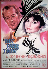
Here is my layout for the October poster 'My Fair Lady'.
' Love this movie! My inspiration came from the painted background
and the large black & white bow, which I made mine out of material.
I also made lots of handmade flowers.
Covered all the criteria: used shades of pink, blue title, and a hat which
in at the bottom right corner. Looking forward to seeing everyone's creation.'
Regards,
Marisa Page
Marisa Page
You did a great inspirational page this month Marisa. I love how you used paint and also the scalloped squares as the background pp. Mmmm.... who doesn't love scones, jam and cream :)
I love the flower cluster and bow in the corner. Great work. Cheers Shazza





+-+sometimes+angels+come+without+wings.jpg)































Wow - I'm really loving that cluster of flowers with the ribbon in it. Looks amazing!
ReplyDeleteOh this is just gorgeous!!
ReplyDeleteWhat an amazing layout Marisa! I absolutely love the painted background to mimic the poster and that bow is a superb idea!
ReplyDeleteMarisa, once again your layout has just blown me away, and I am so in love with your embellishment cluster in the corner :D
ReplyDeleteTHIS IS STUNNING Marissa....LOVE the background and the cluster of embellishments in the corner.... BRILLIANT
ReplyDelete