Lynnda Hosni - Monroe Style
Hi Shazza,
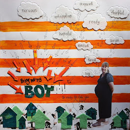
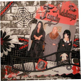
Attached is my take for March Challenge... It took me awhile to complete this simple layout.... To be honest, I'm stumped with S2S Challenge ...its always different from the rest...but in a way it's good for me... so I'm outta my comfort zone and style....
The background paper is from Crate Paper... it is orange but to make more orangy...I color with Orange paint.... Prima Marketing Black Swirl - for the swirl, Martha Stewart Doillies and twine as the spirograph...and me as the A black silohouette figure ...
Thanks for the chance again... for more visit me over at http://lybeauartyscrappy.blogspot.com/
Lynnda Hosni
Hi Lynda!
Thanks for joining in the challenge this month. Some of the FS2S challenges are harder than others, this months challenge was not easy to incorporate all the criteria. I always love the different interpretations of the challenge, and appreciate all the entrants that have a go!
I love how you have have done a negative space challenge and love all your swirls and twine.
Great photo for your silohouette figure. Well done- Shazza




+-+sometimes+angels+come+without+wings.jpg)

































Oh I love your style Lynnda, a brilliant page!
ReplyDeleteGorgeous painted background, lots of negative space & a fab photo beautifully embellished....thanks for joining us!
This LO is totally stunning. A real WOW moment when you see it as it is so eye catching. FABBO.
ReplyDeleteWonderful colour work and use of black on this layout. Well done.
ReplyDeletewow Lynnda, your not wrong about making the orange more orange! Looks incredible, love your layout, and glad that we push you outside your comfort zone and yet you seem to come through the other side with some amazing layouts!
ReplyDeleteVery effective and such a pretty flower added too.
ReplyDeleteThis looks AWESOME!!! I love it!!! You have totally done yourself proud! WTG and thanks for joining in (even though it was a bit harder this month!). Great work!!!
ReplyDeleteOh I just love it! The photo is awesome, and I love the patterned paper with the paint on it! Lovely :)
ReplyDeletethis is great Lynnda- love the embellishments on this and the cool photo
ReplyDeleteThis layout looks soooo cool Lynnda!!! Love the ornage paint and all the blacks!!
ReplyDeleteThe title is very original and goes so well with the picture!!
wowser!!! i loooooooooooooove this Lyn! gorgeous LO and picture of you.love the orange paint. glad you can join us again this month. :D
ReplyDeleteThank you so much ladies... your sweet comments makes my day brighter!!!.... hugs...xoxo
ReplyDeleteWell done, this looks fantastic
ReplyDelete