Saturday, October 31, 2009

Come meet our new Design Team Member

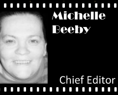
Michelle Beeby - Chief Editor


Please welcome Michelle to 'From Screen 2 Scrap'


I'm Chelle and I live in a small country town in South Australia. I'm a SAHM of 4, wife to 1 and totally addicted to Scrampin' (Stampin' + Scrappin')...

I have been scrappin' for ohhh, over 7 years now, and stampin' for a little over 4... I've also just discovered that digital isn't "cheating" and am having fun riding the learning curve. I also LOVE to alter things, there is a running joke in this house that if you stand still long enough, mum will alter you!

Last year I signed up to be a Stampin' Up! Demonstrator as I just love their line of stamps and paper and inks and everything really! I love product, all of it, and usually hoard as much as I can sneak in past hubby... lol He is so supportive of my hobby, and encourages me daily and is always good for feedback or pulling me back if I've ventured a bit off track.

I have Spina Bifida and am in a wheelchair, I think that is why I was drawn to crafts as I am on equal footing (or in my case, wheeling, lol) with everyone, in this area of my life at least.
Whenever someone tells me I cannot do something, I enjoy the challenge of proving them WRONG!

If I could wish for just one thing, it would be more time in my day, I have so many ideas running around my head that I can't squeeze them all out and sometimes get clogged and need a good clearing out - altered notebooks are handy for this.

My children Larissa (18), Robert (16), Stuart (14) and Peter (almost 6) are my inspiration and why I want to get my story and my family's story down for them... we don't have an extended family as such (my grandmother is still alive and I love her to bits, she will pop up in a LO or two I'm sure) so I need to find out the who, what, when and why and make sure it's down for my children's children's children.

I started with scrapbooking because I was trolling e-bay for something (I can't even remember now what it was) and came across a paper punch in the shape of a heart, I had to have it, I wanted to play with it, I'd never seen anything like this in my life! SO I bought it and when it came I decided to do a "google" search on ways to use it... and whola, my love of Scrapbooking was caused by that simple purchase. Before that I enjoyed cross-stitch (anyone want my UFP?).

So that is my story..

Ooh, before I forget........Chelles Favourite movie is
The Rocky Horror Picture Show!!


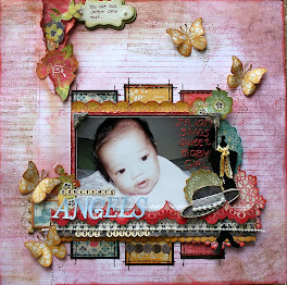
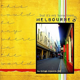
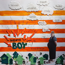
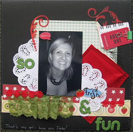
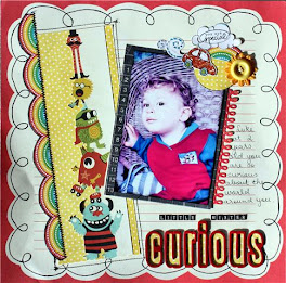
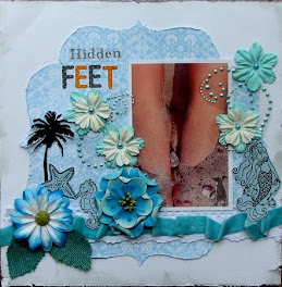
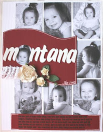
Here are some of Chelle's layouts, some traditional and some digi :)

Abstract


Vegemite


6


{AC}


Grandmas Clock


Nice - Naughty


Peter - School

A big welcome to you Michelle from all of us here at 'From Screen 2 Scrap' we look forward to getting to know you, and hope you enjoy your time on the Design Team.

If you want to see more of Chelle's beautiful creations, go visit her blog at
http://aussiescrapaholic.blogspot.com/
and leave her some love :)

........and become a Follower


TFL
Shazza


Friday, October 30, 2009

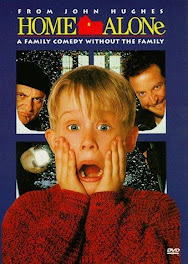
In no particular order, here is a blog roll of all the Home Alone Movie Poster entries for the month! This helps the Design Team with the judging of entries :) So hang in there, it will be a day or so before we get back to you with all the winners !!!

Thankyou to everyone who entered this months challenge, we had 12 entries, which is a fantastic effort and I can only thankyou all for participating and for helping to make this challenge site Great!!

I hope you all enjoyed the 'Home Alone Movie' challenge and look forward to you all playing along again in November......... :)

Anita Bownds - My Girls

Jennifer Manis - These Times

Nikki Love-Salinas - The Climb

Natalie Elphinstone - Family Ties

Tanya D Joseph - Carnival - Egyptian Style
Michelle Beeby - You Guys

Tina Holmstrom - A Day at the Dinosaur Museum

Lisa Lofthouse - Home Again

Jacqui Miles - My Family

Fiona Whitehead - Night at the Houston Museum

Peggy Schenkels - Careful

Lisa Kamphuis - Kind and Fun

TFL
Shazza

Thursday, October 29, 2009

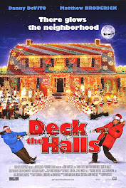
Octobers Poster Inspiration

I am putting up Octobers inspiration early whilst we wait for the DT members to vote on the 'Home Alone' entries.

so without further ado.......

Introducing........


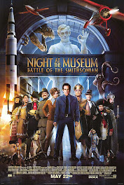
Night at the Museum
(Battle of the Smithsinian)


Plus criteria = 1. Use a group photo

2. Yellow or gold title

3. Use one element from the poster - a dinosaur, monkey, plane, rocket, squid etc.....
OR
3. Something inspired by one of the figures in the poster.......
example #1 The Pharoah = a pyramid or egyptian theme
example # 2 Napolean Bonaparte = the Eiffel tower

Cant wait to see what you come up with!!
Cheers
Shazza

email entries to shazzaalleyes@hotmail.com

A last minute entry from .........

Tanya D Joseph - Carnival - Egyptian Style

the king tut in the pic...I actually made---- for mrdi gras-we go to new orleans and our group chooses a theme...this past year we chose EGYPT..... I made the king tut our of a plastic golf club caddy....socks....mask.....egg crate mattress......beads and pebbles....but we made it half an ice chest and half a dry storage for food for mardi gras day...and we bolted it to a wagon base and pulled it around......

Here are some pics of Tanya's work in progress til completion, just so you can get an idea!


Well done Tanya, I love all your bits n bobs, love the orange tinge to your layout, you have really captured an Egyptian feel to your layout. Thanks for sending the pics of your king tut sarcophagus. I love the transformation from the golf buggy to the pull along drink and food chest..........amazing!! Love it!! - Shazza
P.S I will also post this on my personal blog, so others can see it too :)

A last minute entry from .........

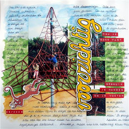
Peggy Schenkels - Careful


This is what Peggy had to say about her page.......The translation of the title is "Careful", and the red dymo letters say: "Hold on tight" and "Use your hands and feet". The red ropes are stitched.

Journaling:
This picture tells it like it is!
Christina is perfectly happy at the bottom of the ropes. She has always been the kinda scared one.

Yannis would love to join Chloë at the top, but his careful nature spots too many dangers.
Chloë on the other hand ... Chloë doesn't see any danger. From the moment she could walk, she was climbing on every little thing (and I do mean every little thing), and that hasn't changed. This means I'm never at ease when we go to the playground. It seems I spend most of my time shouting for her to be careful, to hold on tight, because you see ... not only does she always climb to the highest point possible, she does this in a way that makes your heart just plain stop. She jumps from one rope to the other, letting go of both hands and feet at the same time... have fun baby girl, but please, be careful!

I painted the background with watercolour paints on plain white cardstock. I like painting on watercolour paper better, but since I only wanted to create a background it didn't matter all that much that the paint dried to quickly for the colours to blend in nicely.
I handmade the title (with an ordinary yellow marker), and I stitched the red ropes which were out of the picture (inspired by the pyramid as part of the challenge - you gotta love those challenges, they provide so much inspiration!).

Wow!! Yes Peggy , you just made it in time, and it was so worth waiting for.........
Peggy this is amazing, what a fantastic layout, you have really put a lot of time and effort into this page........ What a great pic to work with. Fantastic!! - Shazza

Thanks to Peggy, A Runner UP!! prize will now be added to the prize pool. I will get a prize organised this afternoon . More prizes to share with the entrants
:)


Sunday, October 25, 2009

Sorry!! Forgetful me!! FS2S October Competition

I forgot to put Octobers competition up............

Name as many movies as you can, that Shawn Levy (Director of 'Night at the Museum)
has directed and/or produced.


Email answers to shazzaalleyes@hotmail.com (FS2S October Comp in subject line)

Quiz closes midnight Saturday 31st October.

All correct answers will go into a hat and a winner will be drawn

Prize = RAK of goodies

*****************************************

Last days to get your entries in for Octobers competition and challenge!!

We have 4 more days to go till Octobers 'Night at the 'Museum' challenge ends!

Entries for Octobers Challenge will close on .... Thursday 29th October
at midnight SHARP!


OOooh.... I forgot to add, If I get one more entry I will add a 'Runner UP! prize!!

That will mean 4 prizes for the month :)


Cheers
Shazza

Sunday, October 18, 2009

Take Three, Scene Ten.......

Nikki Love-Salinas - The Climb

Heres what Nikki had to say on her blog.........On "the climb" I used the planes from the poster as inspiration. I broke into a very old stash of boy rub-ons for this one and I journaled in black and in white to add more contrast and interest. This patterned paper is about as old as my teeth too so it was nice using some of it up. I nabbed that B-SAFE Bingo card from my electric company when making a payment for the restaurant. I thought it would make a great accent on a boy page.

This page is really eye catching Nikki! The (old) pp's and embellishments give it an 'olde world' feel. Interesting photo of Christian and his kinder friends, climbing up the slide......it must have been a very high slide!! Well done, love your page!! - Shazza

*****************************

Entries for Octobers Challenge will close on .... Thursday 29th October
at midnight SHARP!

You still have over a week to get your entries in :)

Cheers
Shazza


Saturday, October 17, 2009

A little bit of info about the director of 'Night at the Museum'.....

Shawn Adam Levy (born 1968) is a Canadian-American director and actor. Levy is the director of Big Fat Liar, Just Married, Cheaper by the Dozen, The Pink Panther, Night at the Museum, and Night at the Museum: Battle of the Smithsonian. He has also directed many television shows, including Cousin Skeeter, The Famous Jett Jackson and Pepper Dennis.


He was born in Momtreal, Quebec. As a teenager, he attended Stagedoor Manor Performing Arts Training Center in New York. Levy graduated cum laude from Yale University in 1989. Levy has a production deal with 20th Century Fox. He is slated to produce the film Back Magick, written by Sahara Lotti,[citation needed] and is producing the upcoming Will Ferrell comedy Neighborhood Watch, being directed by David Dobkin. He has also been announced as the director of The Hardy Men which is an adaptation of the Hardy Boys novels and it stars Tom Cruise and Ben Stiller; a black romance-comedy with Steve Carell and Tina Fey called Date Night and in 2009 was announced to be the director of How to Talk to Girls. He was a strong contender to direct the film adaptation of DC Comics superhero The Flash.

Levy's acting debut was in Zombie Nightmare, a low-budget horror film in which he portrayed the antagonist. The film is best known for being featured in an episode of Mystery Science Theater 3000.

He is known professionally as Shawn Levy, but is not the same person as Shawn Anthony Levy, the American film critic and author who also signs his work as Shawn Levy.

He is also not related to fellow Canadian Eugene Levy.

(thanks to wikipedia - the free encycyclopedia) TFL - Shazza

Take Three, Scene Nine.........

Natalie Elphinstone - Family Ties

This was a great challenge! A bit more difficult! I've used a group photo of me with my brother and sister, and the yellow/gold title. My theme inspiration came from Pokahontas, so trying to think "Native American" I've used neutral colours, and lots of fibre/texture with the big tree embellishment. Cheers, Natalie Elphinstone

Thanks for having a go at this challenge Natalie :) I love the photo of you and your sibs, but I am love'n the tree you have made out of fibre. You have covered all criteria and have done a great job! - Shazza

*************************************************

Entries for Octobers Challenge will close on .... Thursday 29th October
at midnight SHARP!

You still have over a week to get your entries in :)

OH!! and by the way ......... 2 more entries and I will add a Runner UP! prize!!

Cheers
Shazza

Friday, October 16, 2009

Take Three, Scene Eight.......

Michelle Beeby - You Guys

Here is my entry for Screen 2 Scrap.... this one was a toughy!! I think I got fixated on the poster... so I had to stop and start again and check off what the LO requirements where, then it was a lot easier, thanks for the challenge! - Michelle Beeby

Great layout Michelle, looks like you got it all together because its turned out fab!! Love your little rocket and its little puff of smoke :) and the countdown to blast off!! Well done - Shazza

Take Three, Scene seven..........

Anita Bownds - My Girls


Hi Shazza, I had a lot of fun with this challenge I loved the the colours in the poster
I have a love of all things egyptian my fav egyptian god would have to be Anubis .......
regards Anita

Wow! Anita, this page really stands out, I love the pp that looks like a bricked window, you have covered all the criteria and it just looks fab!! Love your god 'Anubis' - Shazza

Thursday, October 15, 2009

Thankyou to our Sponsor !!

A big thankyou to WIOIN (What is old...is new) our Golden Globe sponsor for the month.

.............and the gorgeous prize for this month is one of Octobers Vintage Kits


Kit Inlcudes:
1 piece of Ballerina Fabric
1 Piece of Tulle
2 Asst Green Tara flowers
1 Green Tara Leaf
1 sheet of Vintage Dress Design Book paper
1 Vintage Dress Image
1 Handmade shipping tag
1 Steinbeck House Playign Card
1 Vintage Monopoly money
1 Vintage named place card
1 Vintage German Flashcard
3 Assorted tickets
3 lengths of ribbon and lace
1 pin

Who will be the lucky WINNER!!

Get you entries in, cause it could be you!!


TFL
Shazza

Come on Scrappers!! More entries needed :)

Hi Ladies!

You still have just over two weeks to get your layouts completed for the 'Night at the Museum' challenge plus criteria.............

....................if i get 5 more entries, I will add a Runner UP! prize

So come on give it a go!!


1. Use a group photo (3 or more people)

2. Yellow or gold title

3. Use one element from the poster - a dinosaur, monkey, plane, rocket, squid etc.....
OR
3. Something inspired by one of the figures in the poster.......
example #1 The Pharoah = a pyramid or egyptian theme
example # 2 Napolean Bonaparte = the Eiffel tower

Who will be the next to take up the challenge!!

Sunday, October 11, 2009

Take Three, Scene Six............

Tina Holmstrom - A Day at the Dinosaur Museum

Hello there here is my take on the challenge ! I hope I have done all the criteria.
Was so exited when I saw this photos as I had the right photos to go with it !
My little man got to go to the Dinosaur museum over the holidays with my brother
and his wife !!

#1 - Group Photo of my Brother , Sister inlaw and Tiger
#2- Yellow Title - A day at the (dinosaur) museum
#3- Dinosaurs in photo
#4- Napolean Bonaparte - the Eiffel tower- Tower of Photos & T-rex - Cheers xx Tina

Tina, another great layout from you :) Fantastic take on the challenge, you have covered all the criteria, love you tower of photos and your dinosaurs. What a great color photo, I love it all - Shazza

Finally! My submission....................

..................better late than never!!

Shazza - Us 2 and Billy


I have covered all criteria for the challenge. This is a photo of Hasan and I in Thailand in 2004. We went to the Phuket Zoo and saw Billy the amazing orangatang. He was just like a little kid, he even kissed me on the cheek... he was so cute!! I have used bits and pieces from my stash :)

Hoping to see more entries this month.
You have over two weeks to get your layouts done!
so, hop to it......plenty of time :)

TFL
Shazza

Monday, October 5, 2009

Another 'Night at the Museum poster' inspired layout....... from


Jennifer Manis - These Times


Hello! Here's my layout for the Night at the Museum poster challenge. I tried to make it a little French-oriented. My group photo includes my birds too! My layout is titled 'These Times'.
Thanks for another fun challenge........Jennifer Manis

Hi! Jennifer, thanks for your entry, love the group photo of you with your birds - not sure who is smiling the most........a great family photo :) Your pp is divine and does have a French feel to it!
Well done - Shazza


Sunday, October 4, 2009

Look at this Fab layout, from...

Lisa Lofthouse - Home Again


Lisa said.......I was inspired by the colours... I have all the required elements... The reason for the Eiffel Tower in the title is we had just returned from an exchange trip to France when this newspaper article was done.

Great take on the challenge Lisa, I love the Eifel tower inspired 'A', it looks fab. Wish I could read the contents of the article (need the hubble telescope!!) and there you are front and centre!! Would love to go to Paris one day, how lucky are you!! - Shazza

Saturday, October 3, 2009

Hey! Look at this entry from......


Jacqui Miles - My Family


This is what Jacqui had to say......Hi Shazza this is my Lo
for screen to scrap hope you like it! My Inspiration for
this challenge layout was the Rocket... as my 2 year old
thought it was cool mum!!! I used yellow Thickers for
my title, with a group photo of my lovely family, and
the rocket paper is from rasbery.


I love your layout Jacqui, love the idea of the family pic in the frame, and your doodling around the card stock. You have covered all the criteria, even down to the little orange rocket :) Well done! Another great layout from you... Shazza

Friday, October 2, 2009

Take Three, Scene Two..........

From

Lisa Kamphuis - Kind and Fun

This is what Lisa had to say......Here is my layout for From screen to scrap - group photo, gold title - sprayed with gold glimmermist, and I was inspired by Napoleon and the layout has a french feel to it - stamped eiffel towers, french fashionista ladies and french crystal chandelier ....

Lisa! How do you do it? You always come up with something striking and eye catching. You have covered all criteria perfectly. Well done! - Shazza

Thursday, October 1, 2009

From Screen 2 Scrap Trivia Quiz Winner!!


Seven ladies participated in the September Trivia quiz!


All the correct answers went into a hat draw for a RAK of goodies.


and the winner, drawn by my daughter Jenna,


is .................


Sandra Wilkinson


could you please email me your address Sandra so I can get your prize into the mail

thanks everyone that had a go, there will be another Quiz or competition during October so look out for that one......

Cheers
Shazza
Our First Entry - Take Three, Scene One from..........

Fiona Whitehead - Night at the Houston Museum


Here's mine - I loved this theme ! Fiona x

Fiona this is great, love the masking of the back ground cardstock, your 'Museum' title looks like postage stamps, well done - Shazza

and Lucky last is Shazza......

Sorry guys mine ended up on the cutting room floor, literally............

Will try and get it pieced back together and posted shortly :)

cheers
Shazza

A submission from our Guest DT member for October....

Jayne Smith - School Concert

Photobucket


I have used a group photo, yellow title and something inspired by one of the characters.
The inspiration I got from the poster was that it was about history being a museum so I used an old school photo of my mums on my layout. My something inspired by one of the characters is the hessian and the flower being natural things or things from nature. The inspiration came from the native Indian character (sorry don’t know her name). Hope all that makes sense J

I love those old school photos, great use of Hesian, I think the Indian ladies names was Pochohontas, a smart layout, great take - Shazza

Lisa's Submission......

Lisa Hanrahan - Explore


Here's what Lisa had to say...
I opted for a non traditional group photo of my family at the beach.
I used the movie poster like a sketch with the yellow journalling spot
for the arch at the top, the yellow title "Explore" for the movie title and the
group photo toward the bottom. I added chinese paper and a splash of red
for the "Attila the Hun" character and a tag with an American President.


Gorgeous page Lisa, a very balanced page, love the colors you have used and your flower stacks, a really pleasing layout - Shazza