Lisa Hanrahan - Explore

 Here's what Lisa had to say...
I opted for a non traditional group photo of my family at the beach.
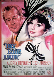
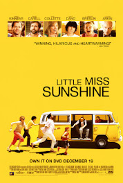
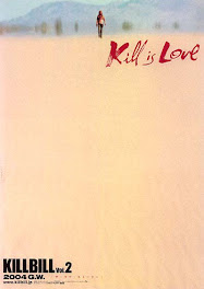
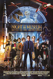
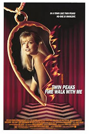
I used the movie poster like a sketch with the yellow journalling spot
for the arch at the top, the yellow title "Explore" for the movie title and the
group photo toward the bottom. I added chinese paper and a splash of red
for the "Attila the Hun" character and a tag with an American President.
Gorgeous page Lisa, a very balanced page, love the colors you have used and your flower stacks, a really pleasing layout - Shazza





+-+sometimes+angels+come+without+wings.jpg)




































i absolutely love your example lisa, i have a thing for 81/2x11 LOs, just love it
ReplyDeletewow Lisa this is fantastic! Love how you have used a different size format for your layout and the grouping of your elements is perfect!
ReplyDeleteawesome LO lisa and the colours....
ReplyDeleteGreat layout Lisa! Love the photo, the contrast of the bright colours really make the page!
ReplyDeleteLove the splashes of colour Lisa. Awesome take on the challenge and turning it into a sketch
ReplyDelete