Ali Coles - My Family

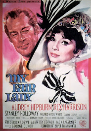
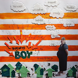
This is what Ali had to say....I used the poster almost as a sketch but as my paper was square I used all the sides for my photos! I kept to the same colours as I love this combination! I kept it quite plain and simple like the poster with a few buttons and a flowers as my embellishments with a few small rub ons added to some of the photos. Great challenge this month Shazza! Really enjoyed it thanks!
Great take on the challenge Ali, love all the those photos, your centre color really stands out and draws you into the layout. It may be plain and simple but its really eye catching... Love it!! - Shazza





+-+sometimes+angels+come+without+wings.jpg)
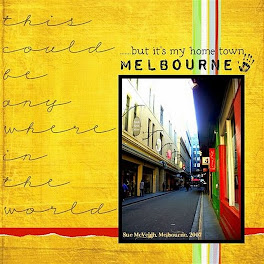



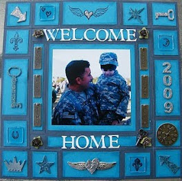


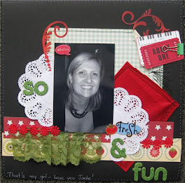

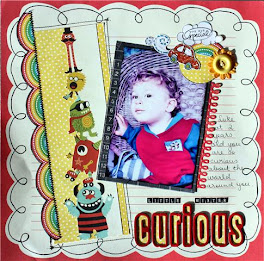



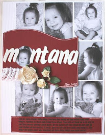




























Wow look at all those photos Ali - love the how you have framed them around your title
ReplyDeleteAli, I love layouts like this, and you do it so well, I always struggle with this sort of layout, I think I skipped the random gene, love this layout!
ReplyDeleteThanks guys! I printed out so many photos as i was going for a double spread but I just couldn't get it to work so I had to cut loads of photos (which for a very indecisive Libra is very hard to do!) and go with one page. I am happy with the end result though. Looking forward to seeing everyones take on this months challenge.
ReplyDeletewow love the use of so many photos on a layout, great Ali!
ReplyDelete